Activity E explores the presentation, visualization, and interpretation of data.
This activity explores presenting data.
The Setup
This is an epistemological exercise (that is, you’re playing the part of an expert within a fictional narrative). You are a freelance statistician and researcher hired to dig into a particular phenomenon and report back your findings to a group of non-statistically-minded stakeholders. In short, you need to present your data to people that don’t understand statistics. Your document should be visually clear, well-written, and professionally presentable.
For this, we’ll be using the built-in data sets inside R. You can also get information on them inside RStudio by using the library(help = "datasets") console command. You may also use the palmerpenguins package if you like.
Steps to Completion
Choose a dataset that interests you (this is different from the final project dataset, which is an outside dataset from the tidytuesday collection) and begin analyzing it. Your job is to pick it apart, explore it, find interesting and/or curious relationships among the data. Did you choose mtcars and notice the relationship between horsepower and mpg isn’t linear? What does that tell you? What information could you give to your stakeholders (your “audience”) about this? Why is it important?
(Don’t choose mtcars! That’s just an example!)
You’ll be creating a report or deck with at least 5 different tables and figures and well-written narrative accompanying each explaining why you’re sharing that data/test/visualization and what it tells you. The tables and figures can be technical but your narrative should be written clearly, simply, and be understandable by the layperson. If you’re choosing to create a slide deck, you need to have captions on the slide with the table or figure, but your narrative can be in the speaker notes. Each kind of table or figure should only be used once! For example, you might include a scatterplot, a bar chart, a table of descriptive statistics, a correlation matrix, boxplots, an ANOVA, and so on.
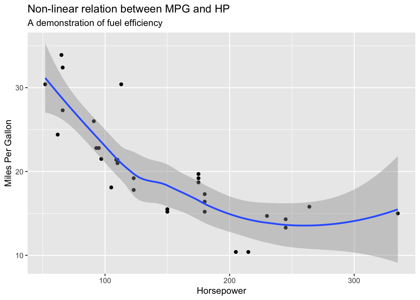
The mtcars example above might look like this in a document. The code below is visible for demonstration. You should set echo: false in your document.
```{r}#| message: false#| warning: falselibrary(ggplot2)ggplot(mtcars, aes(x = hp, y = mpg)) +geom_point() +geom_smooth() +labs(x ="Horsepower",y ="Miles Per Gallon",title ="Non-linear relation between MPG and HP",subtitle ="A demonstration of fuel efficiency" )```
Here we can see that miles per gallon (MPG) and horsepower (HP) do not have a direct, linear relationship. In fact, some outliers have considerably lower MPG while having less horsepower than others, while some have almost double the fuel efficiency with no discernible loss in horsepower, suggesting there is another complicating factor in this relationship.
For each table or figure you display (a total of 5), an accompanying narrative should be include, like the example above! Remember: you’re only using one dataset for this, so explore before committing!
You may choose to create a slide deck for this assignment using format: revealjs as practice for the final project’s deck requirement or use PowerPoint or Google Slide. This is an opportunity for you to not only demonstrate how the appearance of data presentation impacts its reception but to impress your stakeholders with your knowledge. Well formatted, appropriately styled and colored tables and figures go a long way toward this.
Submitting the assignment
Submit both your qmd and your PDF to the Activity E dropbox in the LMS by the stated due date and time.